Your Cart is Empty
Immerse yourself in a world of selections at one of our
stunning East Coast showrooms. Architessa sources our tile both
domestically and internationally, bringing the best of porcelain,
natural stone, ceramic, and more to convenient locations and through
our national commercial representatives Contact us to
explore an in-store or virtual appointment with an Architessan. Orders
ship worldwide or can be picked up at Architessa's warehouse
locations. Delivery options are available for orders within Virginia,
Maryland, and D.C.

Immerse yourself in a world of selections at one of our stunning East Coast showrooms. Architessa sources our tile both domestically and internationally, bringing the best of porcelain, natural stone, ceramic, and more to convenient locations and through our national commercial representatives.
Contact Us to explore an in-store or virtual appointment with an Architessan. Orders ship worldwide or can be picked up at Architessa's warehouse locations. Delivery options are available for orders within Virginia, Maryland, and D.C.

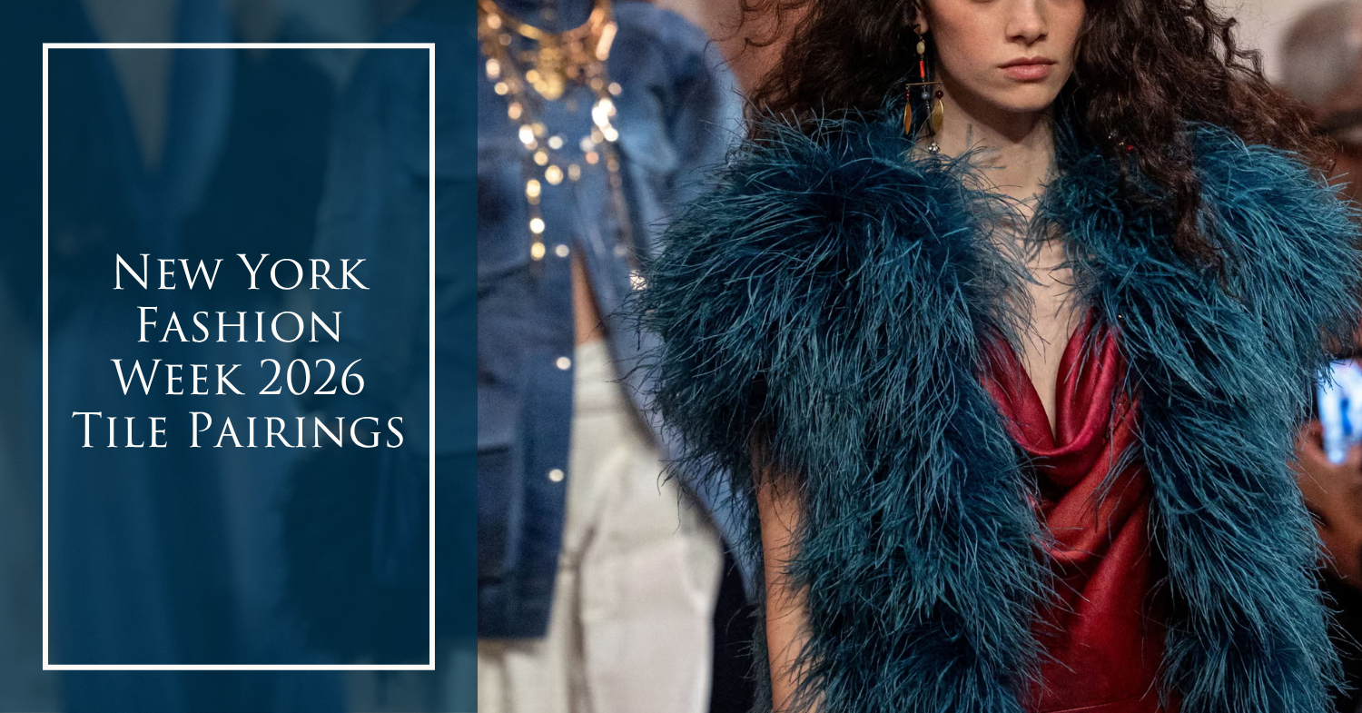
Fashion and interior design have always shared a visual vocabulary. Color, texture, pattern, proportion and material can transform what we wear just as easily as they transform the spaces around us. This 2026 New York Fashion Week, the runway offered plenty of inspiration that translates beyond the closet.
From dimensional neutrals and dramatic black-and-white patterns to botanical motifs and unexpected color combinations, we paired standout runway looks with Architessa tile collections that capture the same design point of view. Here are 10 ways to take inspiration from runway to room.

A delicate geometric motif proves that pattern doesn't need to be loud to make an impact. The Jonathan Simkhai look plays with repetition and open space, an approach echoed by RO's elongated geometric form and KA-NU's bold dimensional pattern. Used across a wall, these shapes turn repetition into a defining architectural element. Pale butter yellow paired with a more striking cobalt blue crash together here and we're loving it!
The takeaway: Look beyond color when translating fashion into interiors. Pattern and shape can be just as influential.

Few combinations have the staying power of black and white. Ralph Lauren's crisp pairing feels simultaneously classic and contemporary, while KALEIDOSCOPE takes the same high-contrast palette and introduces an ornamental geometric focal point.
In interiors, black and white tile can act almost like tailoring. It establishes structure, creates definition and gives the rest of the room a strong foundation. While you may see black and white in traditional style designs, shape can often make for more contemporary and playful applications.
The takeaway: A limited palette doesn't have to mean a simple design. Let pattern provide the personality and contemporary edge.

Proenza Schouler's abstract black-and-cream pattern embraces irregularity rather than perfect repetition. MERCER bianco puzzle mosaic takes a similar approach with stone pieces that form a graphic, almost collage-like composition.
The result is an expressive pattern that feels organic rather than overly calculated, ideal for designers looking to introduce movement while maintaining a restrained palette.
The takeaway: Irregular patterns bring energy to neutral spaces without relying on bright color.

This Altuzarra look shows just how much depth can come from layering understated materials. A deep, tactile black is balanced by a subtle plaid, pairing beautifully with the textured surface of FRONTIER20 and textile-inspired PREP.
It’s a fresh take on preppy style, less traditional, more modern and refined. In interiors, that same approach comes through by reworking familiar plaids and woven influences with tonal color, dimensional surfaces and unexpected finishes. Did we mention plaid is IN?
The takeaway: When color is restrained, let texture do the talking.

Powder blue, camel, cream and warm rust come together in a palette that feels both retro and refreshingly current. SAGUARO translates the western-inspired look into a geometric stone pattern, while SUEDE brings in the warm golden neutral that grounds the combination.
Rather than matching every color exactly, this pairing demonstrates how fashion can inspire an entire interior palette.
The takeaway: Borrow a runway look's color proportions, not just its individual colors.

Warm neutrals continue to prove their staying power, but their appeal increasingly comes from texture rather than color alone. Kallmeyer's relaxed knitwear and the fabric-inspired surface of BOUCLE share a soft, tactile quality that makes beige feel anything but basic.
In an interior, textured tile can bring the dimension of textiles to harder architectural surfaces while maintaining a serene, tonal palette.
The takeaway: Layered texture and even dimensional tile surfaces can be the key to creating neutral spaces with depth.

Black takes on a more dramatic, romantic personality when pattern enters the equation. Christian Siriano's tonal floral detailing finds an interior counterpart in DYAD, where an organic repeating motif softens a dramatic dark background.
The pairing shows how decorative surfaces can make darker interiors feel sophisticated rather than severe.
The takeaway: Treat dark tile like a patterned textile. It can be both a backdrop and a statement.

Botanical design gets a sophisticated runway treatment with dimensional greenery against black, while BOTANICUS translates the idea into an expressive leafy surface for interiors.
Rather than relying on traditional florals, both interpretations use foliage, contrast and organic shapes to create a fresh connection to nature.
The takeaway: Botanical motifs can function as a bold pattern, not just a decorative accent.

Pinstripes aren't reserved for suiting. Ralph Lauren's softly tailored look celebrates elongated lines, subtle contrast and classic menswear details. SLIMWOOD translates that linear rhythm into architectural surfaces through fluting, grooves and repetition.
Vertical tile applications can even borrow one of fashion's favorite visual tricks, drawing the eye upward and emphasizing height through vertical lines.
The takeaway: Use linear tile to bring the structure and sophistication of tailoring into a room.

Kallmeyer's tonal taupes and browns show the sophisticated side of an earthy palette. BETON captures the softer end of the spectrum, while ALLOY introduces warmer metallic depth.
Together, they demonstrate how layering variations of one color family can produce an interior that feels nuanced rather than monochromatic.
The takeaway: Mix finishes and undertones within the same color family to give interiors dimension.
Ralph Lauren + MOMI & PYLON: Polished Layers

Ralph Lauren’s layered look mixes classic tailoring with subtle shine and rich, dark contrast. MOMI captures the reflective, almost jewel-like quality of the ensemble, while PYLON brings in the sleek black finish that grounds the palette. Together, they show how a mostly neutral interior can still feel luxurious through a thoughtful mix of materials and finishes.
The takeaway: When working with neutrals, combine matte, glossy and reflective surfaces to create depth.

A bold blue print paired with crisp white trousers feels fresh while still rooted in Ralph Lauren’s signature classic style. FLORA echoes the graphic blue pattern and organic movement of the top, while PEPPY BEJMAT provides a simple, handmade-inspired white foundation that lets the pattern take center stage.
The takeaway: Balance an expressive patterned tile with a quieter field tile to keep a space playful without overwhelming it.
Loewe + SPILL: Color in All the Right Places

Loewe turns a simple striped silhouette into a statement through unexpected pops of saturated blue, orange and yellow. SPILL takes a similar approach, using strategically placed color within a largely neutral tile composition. Both prove that you don’t need to cover every surface in color to create an energetic design.
The takeaway: Use concentrated moments of bold color against a neutral foundation for maximum impact.
---
New York Fashion Week is more than a preview of what’s next in fashion. The colors, patterns, textures and silhouettes seen on the NYFW runway often reflect broader design trends that influence everything from textiles and furniture to tile and interior finishes. This season’s New York Fashion Week trends show how graphic patterns, tactile surfaces, dimensional details, rich neutrals and unexpected color combinations can translate seamlessly from fashion into interior design.
By looking to NYFW 2026 for interior design inspiration, designers can reinterpret runway trends through materials made for the built environment. A fashion print can inspire a statement tile wall, tailored lines can become dimensional surfaces, and a runway color palette can shape an entire room. Whether you’re following the latest New York Fashion Week fashion trends or searching for fresh tile and interior design trends, the runway is proof that great design inspiration can move effortlessly from New York Fashion Week to the spaces we live, work and gather in.